Here are my results from the Ludum Dare competition this time around. Not as good as the last time, but better than my first entry. My audio didn't work on Firefox for the first period of the judging, so that may have hurt me a little bit (probably not much, since Chrome is more common for LD users and only about half the ratings came in while it was broken).
Some of the games in this competition were really great, and it seemed like fewer of them were terrible than in earlier sessions. The theme was a challenge; obviously, if you're going for minimalism, it's hard to shine in some areas (particularly sound and graphics, but also depth and complexity of gameplay). Art's not what I'm good at anyway (see above), so Minimalism should maybe have helped me out :-).
Tuesday, May 21, 2013
Ludum Dare 26 entry
Here's my entry from Ludum Dare 26. The theme was Minimalism. I went with a game set in a Piet Mondrian painting that only has one control. The Ludum Dare page is here. A direct link is here. I was pretty happy with it; I spent a little too much time on the dialogue opening (also minimalist, I thought). I got some really nice comments, too. Let me know what you think!
Thursday, January 24, 2013
CraftyJS examples
I've been pretty excited about learning more about JavaScript and HTML5 programming. I've been working with CraftyJS, a cool game-design library for browser games. I've mentioned a few of my projects before (e.g. Cairo, Evo, Teeming), but I've also been doing an independent study course this January with a student. She's made great strides in working on this kind of thing. As part of helping her learn this stuff, I made a couple basic demos, heavily commented, for CraftyJS; if you're looking for an easy way to do some pretty neat things in JavaScript, have a look at Invader and Platform - they're bare-bones and hardly games at all, but you can see even from these tiny examples that the library runs well. View source to see the code. Plenty of other information at the CraftyJS site.
Great post on publishing process
I found this post by James Mathe from someone in the boardgame design community on Google+. It's a really great summary of steps to publication (and a cautionary tale for prospective publishing enthusiasts). It includes a lot of costs and steps you probably haven't thought of before.
Friday, December 28, 2012
Les Miserables Report Card
Spoiler warning, if it's possible to spoil a 150-year-old book or a 30-year-old musical.
Pretension warning: I never write like this or talk about movies this way. Beware my crude attempts at artsiness.
My Les Mis Movie report card, more or less in order of appearance:
Hugh Jackman: B- (thought he would be better; ok singing, acting consisted of staring slightly to the left of the camera)
Russel Crowe: C+ (but better than I thought; mediocre singing, good acting, especially towards the end)
Anne Hathaway: A (better singing voice than I expected; suitably tragic. You should get your hair back in the afterlife.)
Little Cosette: A (good voice, good acting, ringer for imagined child version of Amanda Seyfried)
Sasha Baron Cohen: B- (he did fine, I suppose, but I hate the character; I did laugh at a few of his jokes)
Helena Bonham Carter: C+ (like i said, I hate these characters. WTH with the John Lennon glasses?)
Samantha Barks: A+ (when she first came on, I remember thinking, "wow, the first one who can really sing" - head and shoulders above the others. But I'm a sucker for Eponine, too.)
Gavroche kid: A (I normally dislike this character and am almost happy when he buys the ferme, but this guy was surprisingly affecting and sang well)
Amanda Seyfried: A- (better singing voice than I expected, although seemed to be singing in a different style from the others. I've always wished the character had more guts and more to do than merely obey her dad and moon about over Marius)
Eddie Redmayne: B (Marius is such a lightweight character; he did OK, but I thought he blew it on Empty Chairs)
Aaron Tveit: B+ (Pretty inspiring, noble death, sang pretty well, but goofy hair, even for 19th century France)
Tom Hooper: B (Could we ever get a scene that's not mostly a face-on shot of somebody singing?)
Overall: A- (really enjoyed it; would have been better with a stronger JVJ)
It was really interesting to see the show as a movie rather than a musical. I caught parts of the story and character motivations that I'd missed in multiple versions of the stage production. Jean Valjean's progression from desperate thug to flawed man trying to do right while saving his skin to placing others truly before himself.was far more clear here than in the stage productions I've seen. Also, the focus was totally different - you're focused on each character and can see facial expressions and reactions - the acting becomes as important as the singing, which I found surprising.
Unexpected punch in the gut: Javert pinning the medal on Gavroche in the row of dead revolutionaries. My daughter said that was counter to Javert's character from the musical; I agree, but I found it a welcome change; it very nicely bridged the gap between Jean Valjean showing him mercy and his suicide, especially after his admission that he grew up poor on the streets. I thought it was very well done by Crowe.
Unexpected non-punch in the gut: Empty Chairs and Empty Tables - This song leaves me crying in my beer even when Brianna plays it night after night while washing dishes. It was sung kind of wimpily, and I think it needs a stronger interpretation. Also, the destroyed bar wasn't the same for me as imagining him in the same bar intact but with his friends gone.
Awesome scene: Defeated revolutionary pushes through armed soldiers to stand with (and be shot with) his leader. Totally badass.
Scene that was way awesomer in the movie than they could ever do on stage:: Revolutionaries kidnap funeral procession. Also badass.
Monday, December 3, 2012
Planetside 2, SOE, and fraudsters...
I played a little bit of Planetside 2 over the past week. It's an interesting hybrid of MMO (but without quests) and FPS deathmatch (but with strategic points), and because it's free to play, it's got a bunch of enticing content and powerups that you can't really afford without playing forever or shelling out some cash. I really enjoyed Tribes Ascend when I played it a few months ago, and this feels a little bit like that, but with slower, less frenetic gameplay, a different, more complex equipment system (though Tribes has lots of options) and longer protracted battles. And no jetpacks. I think Tribes is a better FPS, and there's no beating the jetpack play, but the strategic elements of Planetside (terrain control, the potential for coordinated vehicle/infantry/air assaults) are pretty cool.
With the end of my semester coming up, I thought it might be fun to play some more once grades are in. So, I tried buying a month pass. As a shareware author, I very much think I should support the games I like, so I threw some money at Tribes also. But in this case, I entered my information, but my card was declined when I tried for the payment. I tried entering again, and it didn't even let me enter the information. I had to call the credit card company to get my card returned to service.
So, what does this mean? They instantly assume every transaction with Sony Online Entertainment is fraud? I, a guy who buys video games pretty regularly, couldn't even pay for it. That's got to reflect badly on the nature of users of online games, particularly Sony customers, and on the state of credit card fraud. I know, one datapoint and all, but it was definitely a surprise. I wouldn't want to be Sony in this case.
Thursday, November 29, 2012
Transatlantic Yoggity
Yoggity is off on its way to Bochum, Germany for the Hippodice competition. The game cost me $20; shipping was $30, and the entry fee was 10 Euros ($15 after Paypal fees). Entering these contests isn't cheap, even though it sort of seems like it is when you get started. Of course, the Hippodice fee is very reasonable for the hassle they go through hosting the contest, and the rest is just my costs.
Regardless, I'm happy to do it; Hippodice gives useful feedback, which I haven't found to be the case for many of the contests I've entered, and I really like the way they have the contest set up. Looking over Yoggity again, I was very grateful for Jason Greeno's terrific artwork - I think the game is great, too, but his art and design really makes it much more fun.
Probably won't hear anything until next year - but I'm glad to have the opportunity.
Monday, November 19, 2012
Yoggity makes the cut at Hippodice 2012-13!
I just found out yesterday that the folks at Hippodice have requested Yoggity for their second round. That means I have to get a physical copy to Germany, which is a challenge, but it should be fun to see what they say. They got 150+ entries; I'm not sure how many made this cut, but I assume it's no more than 50 or so, maybe 20-30, because they have to play them all. Pretty neat.
Kickstarter a no-go for stores?
Via Tom Vasel at GameSalute, Gary Ray at Black Diamond Games has put up a pair of posts (here and here), where he says he's not going to support Kickstarter projects for his retail game store any more. He says they just don't sell, at all, so that seems like a reasonable business proposition.
It's also a different criticism than Kickstarter game projects usually face. Normally, the knock on them is that they are incompletely tested and of lower average quality than traditionally published "mainstream" games. In this case, Ray suggests the problem is that Kickstarter just works too well. Everybody who would buy a small indie game has done so already on Kickstarter, and often has received special funder awards and bonuses. Nobody goes looking to a game store for such a project.
I think there's a distinction between true indie projects, that is, one-off titles where the creator funds just one game through Kickstarter, compared to companies that use Kickstarter to generate interest and funds for new projects (e.g. Tasty Minstrel and GameSalute). My guess is that companies still have pretty significant testing and development filters in place, and their games are likely to be (on average) of higher quality than the one-offs. However, Ray's point is that it just doesn't matter - because neither of them sell - and his stated policy is now that he won't stock any game that says "KickStarter" on the box.
That's an interesting policy, for a couple of reasons:
- It seems like a broad stereotype; some Kickstarter games can and do have broad appeal, and probably do sell to markets beyond the Kickstarter/game enthusiast audience. But I've done enough work in my shareware business and with large organizations to know that sometimes you need a general rule because the simplicity far outweighs the marginal benefit of making exceptions. That might be the case here, and Ray is in a better position to know it than I am.
- It sounds like it would be pretty dumb to put "Kickstarter" anywhere on a box. That really rings true for me. Anybody who funded your game on Kickstarter already knows it was funded there, and for anybody who doesn't, it's either neutral or negative. In Ray's case, it's negative because he won't buy it. In other peoples' cases, it's negative because there's a perception, right or wrong, that Kickstarter games are inferior to traditionally-published games. So, there's no upside to indicating that on the packaging. Unless maybe the fact that your game made it through a successful campaign some how says it's quality? I doubt that influences many people.
So, is leaving it off dishonest? Not really. People who read reviews and do their legwork (and this probably includes most store owners like Ray) will know that it's a Kickstarter game, but they'll also likely know whether it's a good game or a good fit to their tastes. Casual browsers will buy it or not for the same reasons they do all other games - does the art look good? Is the box copy convincing? Does it look cool? So, I think leaving off the Kickstarter is probably just good business sense.
Also, other companies don't tell you the source of their funding, which could be more cockamamie than Kickstarter. I've seen published games that totally suck that seem to be entirely self-funded, and they don't have that on the label.
Interesting stuff to ponder, anyway - the game market does seem to be splitting between the traditional route (which is growing and expanding on its own) and the Kickstarter route (which is growing and expanding tremendously). I'm not sure where game stores fit in, but I know I love going to them, and I'll often buy something. I'd hate to lose that in a sea of Kickstarter projects, even though I've bought and enjoyed several Kickstarter games already.
Saturday, November 3, 2012
Great software design and visualization - Space Sniffer
OK, this isn't game related, but I just found a really great disk profiler. I realized last night that my SSD is filling up on my main Windows computer, and I was trying to delete things to make more room, but I couldn't find much to delete that made a difference.
Today, I figured, there must be some kind of software tool that shows you how your drive is laid out, and I did a search for something. I found Space Sniffer. It quickly scans a whole drive and maps it out for you. On the diagram at right, the beige areas are folders and the blue areas are individual files. Each zone is sized according to its size on the disk, and the hierarchical structure is maintained. Each folder is clickable, and then the program displays the folder's contents in the same way, so you can descend fractally down into your data. The authors say the visualization technique was developed by a professor named Ben Shneiderman, who apparently also invented the highlighted textual link. I will honor his work by linking to him: Ben Shneiderman
Really neat program, and free. Of course, I still didn't find too much to delete - the whole left-most rectangle is games I still play, and the other stuff all seemed important. You'd understand if you saw my basement.
Thursday, November 1, 2012
Hippodice entered!
I've entered two games in the Hippodice competition this fall - Horde and Yoggity. We'll see how I do - I've made the second round once but never their top 10. I gather it's very competitive.
A user named Yort over at BGDF looked at my stuff and commented that it might be more polished than they were looking for. I got that impression when they looked at Diggity a couple years ago - one of the reviewers said, essentially, "why are we looking at this? we're only supposed to look at prototypes." Of course, it was a game prototype at the time, just printed up nicely via TheGameCrafter, and well within the Hippodice rules which indicate less than 100 total copies.
We'll see how I do - these competitions are always a little unpredictable, but I really respect Hippodice for its organization and standards.
Wednesday, October 10, 2012
Ludum Dare 24 results
Voting results are in from the 24th Ludum Dare competition. The theme was Evolution, and I made a puzzle game in which little critters gain traits. I've got it hosted here at PlanktonGames.com; the competition page with all the comments and feedack is here at LudumDare.
How did I do? Pretty well, I think; much better than last time. Here are the numeric ratings and rankings:
The #44 overall is really neat; there were 1006 entries, and I have a lot of top 100 or top 50 ratings in various categories. I'm not sure why I'm so much worse with the theme, since I actually thought my adherence to the theme was better this time than last, where it was my highest ranking (#71).
Anyway, a good experience, and very encouraging results. I think I'll try to develop the game further and get it up on Kongregate or somewhere.
How did I do? Pretty well, I think; much better than last time. Here are the numeric ratings and rankings:
Coolness | 100% | |
#40 | Innovation | 3.83 |
#44 | Overall | 3.75 |
#55 | Fun | 3.58 |
#89 | Humor | 3.15 |
#145 | Mood | 3.11 |
#216 | Graphics | 3.34 |
#242 | Audio | 2.77 |
#294 | Theme | 3.10 |
The #44 overall is really neat; there were 1006 entries, and I have a lot of top 100 or top 50 ratings in various categories. I'm not sure why I'm so much worse with the theme, since I actually thought my adherence to the theme was better this time than last, where it was my highest ranking (#71).
Anyway, a good experience, and very encouraging results. I think I'll try to develop the game further and get it up on Kongregate or somewhere.
Saturday, September 29, 2012
Bad game design
From The Whitest Kids U'Know. I think a few of my early designs might have shared this flaw.
Sunday, September 9, 2012
LOTR: The Fellowship of the Ring
Picture by Tony Mastrangeli, DarkJedi on Boardgamegeek.com |
The good:
- The modular board - fun to put together; fun to reveal different tracks and people as it goes.
- The structural parts - the ramp spaces up the mountain are very neat
- The group storytelling - it really recreates the movie pretty well, with major plot points thrown and enacted by the players
- The pieces - the rings and the scoring racks are cool; the cards are very attractive, and the pawns with full-color pictures and art are really neat
- Choice - There's very little meaningful choice for the players. You can pick a different character to activate each turn, and this tells different parts of the story, but all the parts will happen eventually, and there are way more characters than there need to be. They have different statistics, and they can pick up items along the way, but these hardly ever matter much. If you face a challenge that you have trouble with, you just keep rolling until you win, or you bring around another character with higher statistics.
- No replay value - the game will turn out the same virtually every time you play it. There's an elaborate set of 70+ events, but they happen in mostly the same order, and they don't interact much at all except to move people around the board. None change the overall course of the game, which is destined to follow the movie's story. There can be trivial differences in path or scoring based on die rolls, but the game will vary hardly at all from one play to the next.
- Rules - the rules are very short, and they don't really explain all of how the game works. We figured it out, but there were some events right off the bat that used terms (e.g. ring bearer) that were not defined, and there were other times when we weren't sure how to use various pieces and had to figure it out from cards. We still don't know how to resolve Nazgul attacks.
- Scoring - the scoring is a good vs. evil rating that you gain from events on your turn. Most of the good or evil that you earn comes automatically from drawing an event or is randomly generated via die roll. It is very difficult to gain very much evil score. By the end of the game, you will have exceeded the scoring scale in the good direction, and this triggers a crude balancing mechanism - you lose 1-6 points when you come to the end of the track. So, the player whose score gets reset last, or who rolls highest when losing points, will lose the game pretty much every time. This is all essentially random, and takes an hour or more of play to get to.
Friday, August 31, 2012
Ludum Dare 24
I took part in the 24th Ludum Dare competition last weekend and produced a computer game in 48 hours (well, more like 15 hours - I had to sleep, eat, celebrate my birthday, and perform in two improv comedy shows at the Idiot Box). The theme (revealed Friday night at 9pm) was Evolution.
I've now rated around 40 of the other games, and there's a huge variety of ideas, themes, game styles, and choices, and also skill levels at putting games together. I've gotten some nice comments from mine; like a lot of my stuff, art isn't the strong part (especially with only 48 hours to work), but the gameplay is pretty fun. Give it a try if you like; it's at:
http://planktongames.com/ld24
The Ludum Dare page for my game is here.
Saturday, August 18, 2012
BGDF Contest for August - Grow Up!
I'm waiting for the results of this month's BGDF Game Design Showdown, with the theme of Grow Up! I haven't entered much in recent months; the restrictions and themes haven't really fit my interests for a while, and I've been working on my novel and other projects. But this month, the restriction was to include a theme of growth over time and to include game pieces which grew in function as the game progressed, which was interesting to me.
These restrictions were actually pretty tough for me, and although I think I met the requirements in a technical sense, I didn't do so in a particularly inspired way. Reading through the entries, I see that other folks had some trouble with this too. I'll be curious to see how it comes out.
I made a prototype of my game and tried it out with friends and family; seems to work pretty well, and I was able to tweak and balance it some after testing. I was inspired enough by this to go ask on DeviantArt for somebody to make some art up for the game. After re-theming the game towards space/sci fi, I offered up $100 for images for the various buildings and cards I need. I've got some leads; I hope they pan out. I hope to work it up on TheGameCrafter.com in not too long, and if more testing is promising, maybe I'll enter it in Hippodice this fall.
Monday, August 6, 2012
Picture worth 1000 words
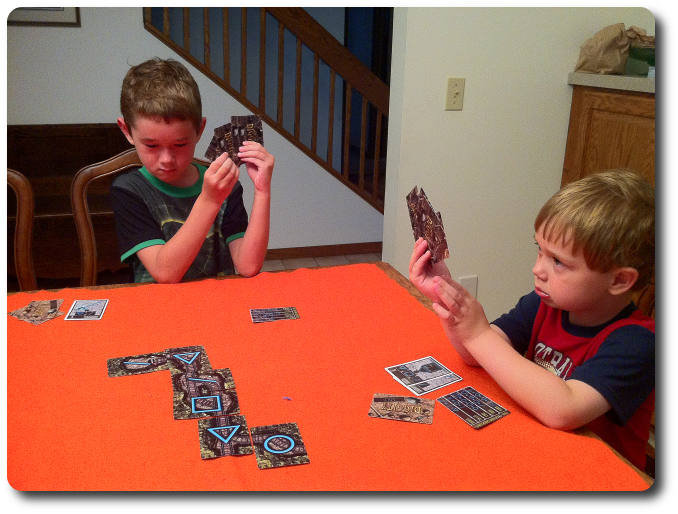
FatherGeek's kids playing Diggity From FatherGeek.com |
Yay, 21st century... :-)
Saturday, August 4, 2012
Good post on principles of game design
Here's a post from IrregularWebComic.net with some great principles of game design. The beginning of the article goes into a historically-sourced explanation/defense of modern games, which is interesting, but not the most salient point for me.
What did ring true was later on, when the author (I couldn't find a name) laid out seven principles of good game design, which I quote here:
- Don't knock players out.
- Don't make it easy for the leader to increase their lead.
- Make catching up to the leader relatively easy.
- Avoid kingmaking.
- Give players important decisions to make.
- Give players difficult decisions to make.
- Give players something to think about constantly.
A game that does all of these things at once would be a good game indeed. The article points out at some length, correctly, that while decisions should be important and difficult, this does not mean they should be complex, and they should especially not be iterative, such that there's a branching tree of possibilities that you need to track down. The author suggests that randomness is a good solution for this; I think that's generally true, but you need still to obey rule #5. If there's too much randomness, then the decisions become unimportant, and luck reigns.
Anyway, good things to keep in mind. Maybe we designers should make a motivational poster with something like this on it to hang over our workbenches.
Friday, August 3, 2012
FatherGeek reviews Diggity
A terrific review of Diggity by FatherGeek!
FatherGeek looks at games from a family perspective, so that's why there's the multi-generational aspect to the review. I was really thrilled by the detailed discussion of strategy that he got into. I've always thought the game was pretty deep for having such simple rules, and FatherGeek's testers really seemed to pick up on that part of it. I'm also really glad they had fun with it!
Friday, June 22, 2012
GameSalute
I've submitted a few games to GameSalute, and they've given me some positive feedback. I had a great talk with Dan Yarrington today; I'm really hoping I can work with them to get my games out to a wider audience. They seem like a really great organization for independent designers; very much like a traditional publisher in some ways (very useful ways, like playtesting, manufacturing, distribution, graphic design, etc.) but also cognizant of the modern indie game realities of Kickstarter and group funding, and willing to let designers retain input and some design control through the design and production process. Apparently growing like gangbusters, too.
Really exciting - I hope we can make it work for some of my designs.
Tuesday, June 19, 2012
Books vs. games
I've just finished writing the first draft of a novel - a project I've been working on off and on for seven years. Now that it's done, I've been doing what I should be doing, namely having people read it and give me feedback, and of course, doing what I should not yet be wasting time doing, namely looking into publishing options.
I was struck by the similarity between the process for books and the process for games.
For both, you have two basic options - try to get a traditional publisher to put it out, or try publishing yourself.
The big problems with the traditional route, for both books and games, are:
The big problems with the self-publishing route are:
In both industries, there are new, inexpensive options for print-on-demand, which is awesome. With games, there's The Game Crafter, SuperiorPOD, and others. With books, there's Lulu, CreateSpace, and many more. These options offer a chance to sell your books or games one at a time, so there's no big investment up front - that's a huge sea change from even ten years ago. Unfortunately, they're also somewhat expensive, so there's not much room for a profit margin going this way.
There are two big differences, though:
For both, you have two basic options - try to get a traditional publisher to put it out, or try publishing yourself.
The big problems with the traditional route, for both books and games, are:
- Only a tiny fraction of games/novels get published
- Whether you get published or not, the path there is fraught with rejection, expense, and heartache
- It takes forever
The big problems with the self-publishing route are:
- You have to invest in printing up your book/game up front
- You may never, ever attract an audience, so your print run and the money that you put into it will be wasted
- Your work will be perceived as (and may well be) lesser quality than the published route, which comes with editing, consultation, and revision built in.
In both industries, there are new, inexpensive options for print-on-demand, which is awesome. With games, there's The Game Crafter, SuperiorPOD, and others. With books, there's Lulu, CreateSpace, and many more. These options offer a chance to sell your books or games one at a time, so there's no big investment up front - that's a huge sea change from even ten years ago. Unfortunately, they're also somewhat expensive, so there's not much room for a profit margin going this way.
There are two big differences, though:
- With books, there are now e-readers like the Kindle and Nook. The customer already has these things. That's great for authors, because you can send them a digital file at essentially no cost to yourself, so even at a low price, you get a good return per book. It's good for readers, because they can get books for very low prices (after they've shelled out for the reader, that is) if they're willing to buy from indie authors and risk the chance that the book is crappy.
- With games, there's Kickstarter, which has become a big new funding mechanism for games. Actually, it's really more of a pre-sale mechanism, which gets the game designer or publisher the money they need up front. That means there's no risk of financial ruin for the designer/publisher, because they already have the money. The risk is distributed amongst many customers, who have less money at stake and risk only that the game will suck.
So, what's the lesson here? Two things.
First, it would be awesome if there were some kind of widely-used standardized e-game platform (like the Kindle or Nook) that you could have people buy and then distribute games to. I know, in a lot of ways this is just a software problem - almost everybody who buys games has a computer or iPad or xBox or something, and there are boardgame implementations for all of these. But most of those platforms aren't ideal for boardgames, and the coding is nearly all one-off, customized. If you had a standardized platform that could handle typical game-related mechanics (large board, cards, dice, tokens, etc.), you could design a game, implement it for the platform, and distribute it to everybody who has one, for a low cost. There are attempts to do this online - boardgame simulators, places like SpielByWeb and Yucata.de - but these are still web-based, and not usually something a family would sit around and do together. There have been some efforts to do something like this (e.g. http://www.kickstarter.com/projects/468008685/global-gamespace) but I'm not familiar with any that have succeeded to the point of having dedicated hardware and a real boardgame feel.
Second, it would be cool to use Kickstarter for novels. A number of book projects are in fact funded via Kickstarter, but the ones I've seen usually books with very high production costs, like books of photos, or comic books, or that kind of thing. There is a fiction section on Kickstarter, too, though, and it has some novels listed. As a novel writer, if you knew you had sales lined up for a book, and you had the money in hand from your Kickstarter campaign, you could use that funding to support yourself while you worked on the book, allowing you to dedicate more time to it and finish faster. You'd also cut out the commissions you have to pay, either to a traditional publisher or to Amazon and Barnes and Noble for distributing e-books. Given that e-books are on the rise, and that printing books is pretty cheap, I think Kickstarter is probably far less important to getting a book published than it has been to getting a game published.
Just spitballing here, but it's been an interesting thing to consider.
Monday, June 18, 2012
Kickstarter for retailers
An interesting post on Kickstarter from Tao, the guy (?) running the game store Starlit Citadel, a Canadian hobby game store in Vancouver. He describes some of the difficulties game stores have in supporting Kickstarter campaigns. Even though he'd like to carry some of the more popular or interesting Kickstarter projects, he can't make it work financially without a fairly generous retailer package.
The only way I think it might work is if he gets a pretty good bulk discount for retailers, and then is able to keep the game in stock for longer than the game is available via Kickstarter. But that's tricky, and maybe not realistic; I bet most Kickstarter publishers produce more than they distribute via Kickstarter, and then he's competing with direct sales (and the much better margins) with the publisher, who's got more room to discount.
I don't think his doomsday scenario will happen (all games funded via preorders through Kickstarter, which would mean that game stores essentially die). Kickstarter folks are generally not expert in distribution (although some are) and aren't in it to sustain a long-term business (Tasty Minstrel would be a counterexample, but they're not typical).
Sunday, June 17, 2012
Diggity site update - new art!
I've got the Diggity site updated including the newer art for the game. Woo.
Diggity Review
The web is ephemeral, and that isn't always great if you're trying to build a following for a game. I've been trying to find a nice review of Diggity that came out a couple years ago. It was by JT at TheGameCrafter.com. It's no longer at the address it used to be, so I'm posting it here to preserve it. The original is still at the Wayback Machine (now Internet Archive) here:
http://web.archive.org/web/20100327145503/http://www.thegamecrafter.com/forums/reviews/diggity
Diggity Review by JT of TheGameCrafter.com
UPDATE: JT pointed out that the review is still present at the bottom of the Diggity listing on their site, but he said it's OK to keep the review here too. Thanks JT!
http://web.archive.org/web/20100327145503/http://www.thegamecrafter.com/forums/reviews/diggity
Diggity Review by JT of TheGameCrafter.com
Rating: 5/5
Diggity is a ridiculously simple game about mining. It's good for 2 to 5 players, and each game takes about 30-45 minutes if you have 2 players, though you could easily add house rules to make it shorter or longer.
The premise of the game is that each player is a miner, and you're all working the same mine to see who finds the gold first. Along the way you're trying to make patterns out of the symbols on the cards, and those patterns let you build "tools" that allow you steal other people's gold. The tools start a bidding war, which allows each player to try to outbid another player for the gold that was just discovered. I might have a shovel, which allows me to steal the gold from the player who discovered it, but then someone else might have a pulley, and still someone else has a cart. You keep playing tools until someone comes up with the ultimate trump card, a shed, or until you get to the highest tool you have.
That's really all there is to playing the game. You build out a mine, you collect tools and gold. Then you build a new mine, collect more tools and gold. However, the interactions with getting the mine pieces to fit together, while still trying to make patterns to build tools puts this game right at the top of the list of games I want to play. Because it's so easy to steal gold, you really need to be strategic about putting out pieces that give you tools so that no one wants to bid against you. This dynamic really adds a lot of strategy and viscous fun.
The rules are well written, and just as importantly, well structured. The artwork is clean, simple, and pretty. And the game is fun. It's hard to ask for more than that.
Though we don't allow games for children under 12 on The Game Crafter for legal reasons, this could easily be played by children, and would probably be a good lesson for them in building patterns out of shapes. Don't let that pull you away from the game though, as this game is easily just as fun with only adults playing it.
UPDATE: JT pointed out that the review is still present at the bottom of the Diggity listing on their site, but he said it's OK to keep the review here too. Thanks JT!
Thursday, May 31, 2012
Diggity video review
The folks over at The Gamer's Table have been doing video reviews of games for some time, and this year they invited submissions of independent game designs for review in their "Indy" series. The Game Crafter offered to pay for the shipping if any of their authors/designers wanted to pay for a game to send, so I took them up on it. The result is here:
The review of Diggity starts at 4:50, and the final wrap-up (where they rate it) is at 13:35. An interesting experience; they seemed to like the game and "get" it, particularly the two guys on the sides (Chris and Craig). The middle guy (Ken) gave it a significantly lower rating than the others, which was interesting - he didn't really say why, and I couldn't pick it up from the rest of the show, but it must not have clicked as well for him.
A lesson for other designers - they really pilloried the other game in the review because of one omission in the rules (play one card per turn). It's important to have other people read your stuff, and to specify everything, even the stuff that seems obvious.
My thanks to the TGT guys for their review, and to The Game Crafter for facilitating it.
Friday, May 18, 2012
May GDS at BGDF
Looking like an interesting roundup at the monthly Game Design Showdown at the Board Game Designer's Forum. People took the "spring" thing in a lot of different ways, mostly literal (a spring-loaded piece of equipment). We'll see how I do on Sunday...
Sunday, May 13, 2012
Ludum Dare results
So, here are my results from the judging for the Ludum Dare competition for my game, Teeming.
The rankings (at left) I think are out of 1,111, so I was top half in all categories, top 1/3 in many of them.
#71 | Theme | 3.82 |
#220 | Innovation | 3.38 |
#265 | Overall | 3.25 |
#325 | Fun | 3.00 |
#394 | Graphics | 2.95 |
#410 | Mood | 2.71 |
#453 | Humor | 2.18 |
#455 | Audio | 2.43 |
The worst one for me was Audio, and that makes sense - the game has only simple sound effects and no music track. Mood is supposed to be how immersive your game was, but I'm not sure people all used the same standards there. Likewise for Humor, which is hard to gauge. I'm happy to be up there in the Overall and Innovation categories, and apparently I hit the theme (Tiny World) pretty well. Graphics will likely always be a problem for me, lacking as I am as an artist.
The last item, Coolness, refers to how many games I rated - I rated (or tried to rate) over 100 games, so I get that one by default (or by dint of hard ratings work). A rank list another guy made shows that I did the 104th most ratings (the average participant made 35 or so).
A fun experience; I'm happy with how I did, but I think I could do better. I'll definitely try again next time.
Two cool things
Two things coming up in the next 6 hours -
- The judging for the 23rd Ludum Dare competition will close. Mine (Teeming) was one of 1402 entries (1,111 in the solo 48-hour competition) with the theme of Tiny World (I went with microorganisms in a petri dish). I've never done this before, so I don't know exactly what to expect, but I did judge 102 other entries over the past 3 weeks, so I've probably seen a representative sample. I hope I make the top 50%, but we'll see. There are some really good ones out there. There were a couple that I saw that were obviously way better than mine, but they were in the Jam segment (72 hours, multiple people designing, relaxed rules on preexisting content)
- My entry for the BGDF monthly Game Design Showdown should go live. This month had a couple of cool restrictions - one was that you had to use asking permission (from Mother May I - Mother's Day plus May), and the other was that you had to use springs in some way. We'll see how many entries there are and how I do - I feel pretty good about my entry this month, but that has historically not been any kind of indicator as to how I do (maybe even negatively correlated).
Game on...
Monday, April 23, 2012
Teeming - Ludum Dare Entry
I figured I'd try my hand at the Ludum Dare game competition, which I learned about earlier this year. The goal is to produce an entire game from scratch, in 48 hours, solo. I think I did pretty well for a first try; give it a try if you'd like.
The theme for this time was "Tiny World," which led me to make a game about life in a petri dish. It's been interesting looking at the other entries (all 1111 of them) and seeing what people did. Huge variety in interpretations, game formats, and programming ability.
Link to the game: http://planktongames.com/teeming
Ludum Dare page for my entry (I think): http://www.ludumdare.com/compo/ludum-dare-23/?action=preview&uid=10977
Link to the game: http://planktongames.com/teeming
Ludum Dare page for my entry (I think): http://www.ludumdare.com/compo/ludum-dare-23/?action=preview&uid=10977
Thanks to my Mom for putting up with me coding for most of a weekend while I visit her in New Mexico.
Tuesday, April 3, 2012
Sound effects
For any of you game programmers out there, here's a sound effects generator called SFXR that is very simple but cool - I often start making sounds with raw noise and alter them significantly in GoldWave, but this does a lot of that work for you with a simple interface.
Subscribe to:
Posts (Atom)